 DC: I'm so glad to see there's something new on the site
As of the sticky menu, this is what I meant:

This is from the YT app. While it definitely has not the best UI in the world, I think the menu looks just right enough to be an example here. A combination of:
 Buttons that are of the same size
 Icons that are displayed together with text
 No useless gaps between active elements (buttons)
 Solid/fill icons to help you know which section you're currently in.
There's also a plus button to post something new, but for this site we don't need that.
I hope this illustrates what I meant.
I also agree with the idea of removing the language selection button from the sticky menu. The site should automatically determine the language by the Accept-Language header value. If there's a `de` in it and it has a weight high enough, then the site language should be German. English otherwise. And the language selection button should be placed somewhere else, as it'll not be that important to be displayed where it currently is.
Another thing I found is that there's no confirmation window like "Are you sure you want to leave this page?" for the posting form. Like, I was typing this all, then clicked on some link, went back, and my message was gone. Luckily, I predicted that, so I was able to do CTRL+V to restore what I wrote, but I think this is kinda harmful as most users except the site to show some warning (or even to store unsent posts for a short time!) Let's say, the site should display a confirmation window when a user tries to open a different page, only in case if the "Message" input was not empty. Safe and not annoying.
Also, this is not exactly a bug, but an idea: when a user wants to add some code inside a message, can we make it automatically detect the language by default, and not suggesting Lua as the default language? There's already an option for auto-detect but I have to select it manually every time.
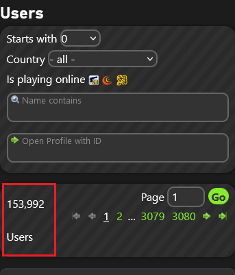
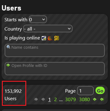
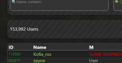
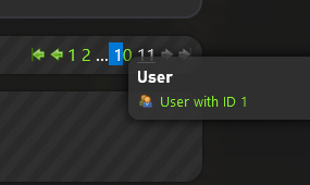
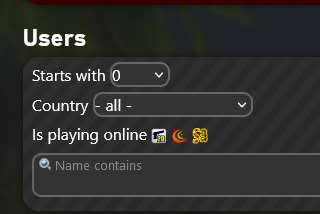
Bugs & Ideas regarding the Users page:
Edit:
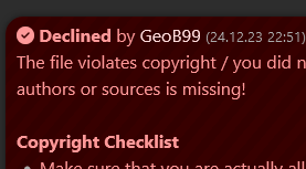
The "Declined" message has the
 icon instead of
  :
:
edited 2×, last 18.02.24 09:53:00 pm

 Unreal Software bugs and errors thread


 Offline

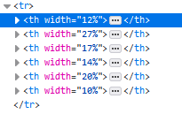
 The same goes for USGN tables, such as server lists, and some may want to parse them.



 ) is clickable and leads to portal, also profile image leads to profile and "community" opens the forum (desktop only)


